Overview
Our research objective revolves around improving the patient experience in specific parts of health system. Through our research we
aim to understand a systems perspective of Translation and Communication in the Health Industry in
Australia.
Furthermore we aim to analyse the prospects of new innovative technologies or products around these spaces: Time, Patient Doctor
Communication, Insecurity, Understanding and Clarity, Confidence and Reliance, Patient Experience Optimisation.
About Project MediBoard
This project was developed at the University of Sydney, Health & Medicine Design Studio in conjuction with Westmead Hospital Sydney.
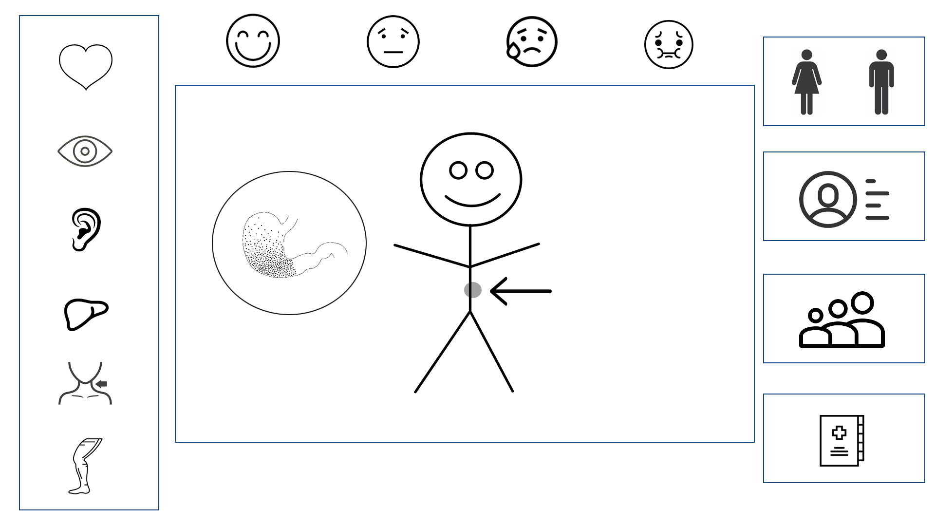
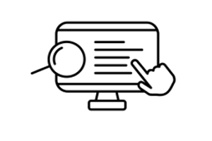
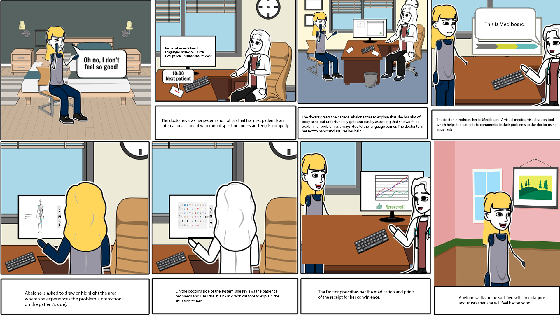
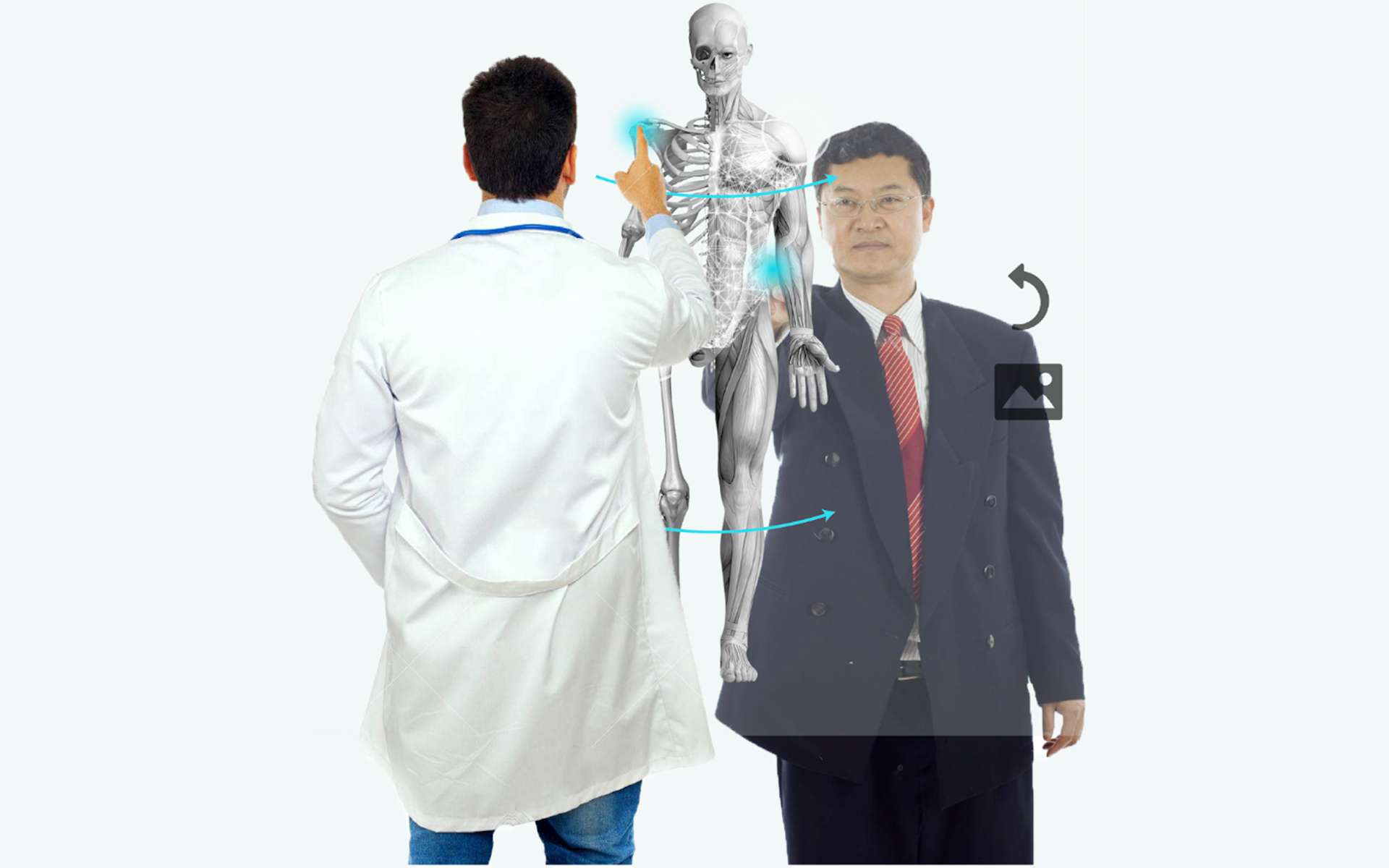
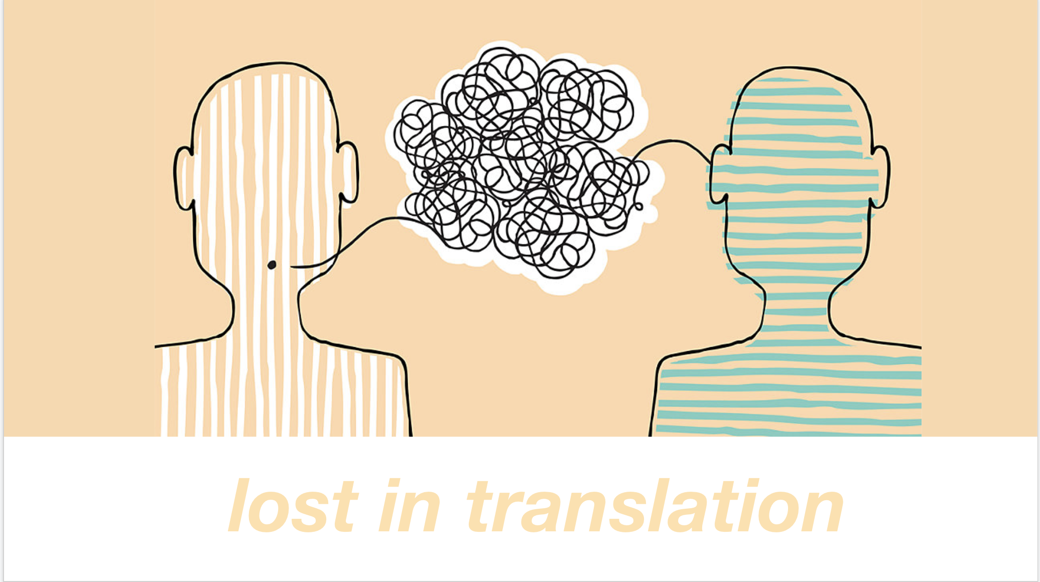
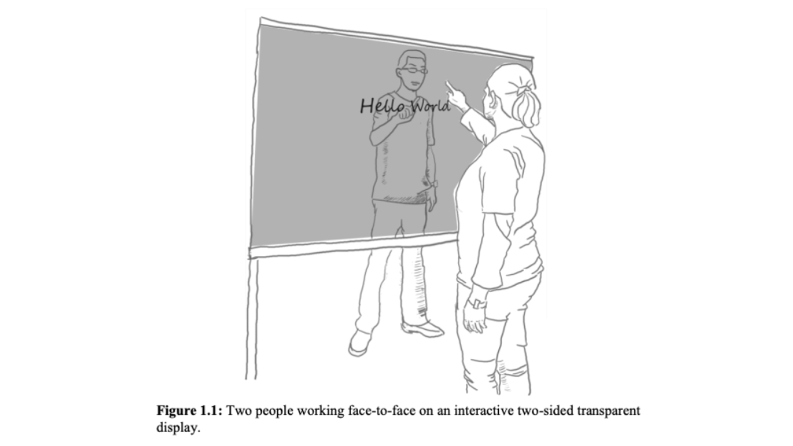
We present MediBoard. MediBoard is an interactive, transparent board system that allows for visual communication between patients and practitioners. Language barriers are reduced, and two way communication develops rapport. Diagnosis is now accurate.
Timeline: 12 Weeks - 2018
Role: UX Researcher, UX/UI Designer, HCI Researcher and Video-editor
Team: Abhinav Bose, Elizabeth Anne, Claire Webb, Celine Chong
Key Stakeholders
In order to ensure resources are best utilised in
a cost-effective and targeted manner.
We decided to
look into Non-English Speaking Patients as our target group.
This issue is more common than you think 4.9 million Australians speak a language other than English at home, and 820,000 can’t speak it at all. The Australian government has had to allocate $54.3 million alone for translating and interpreting services. There
is a clear need to improve healthcare services for this demographic.
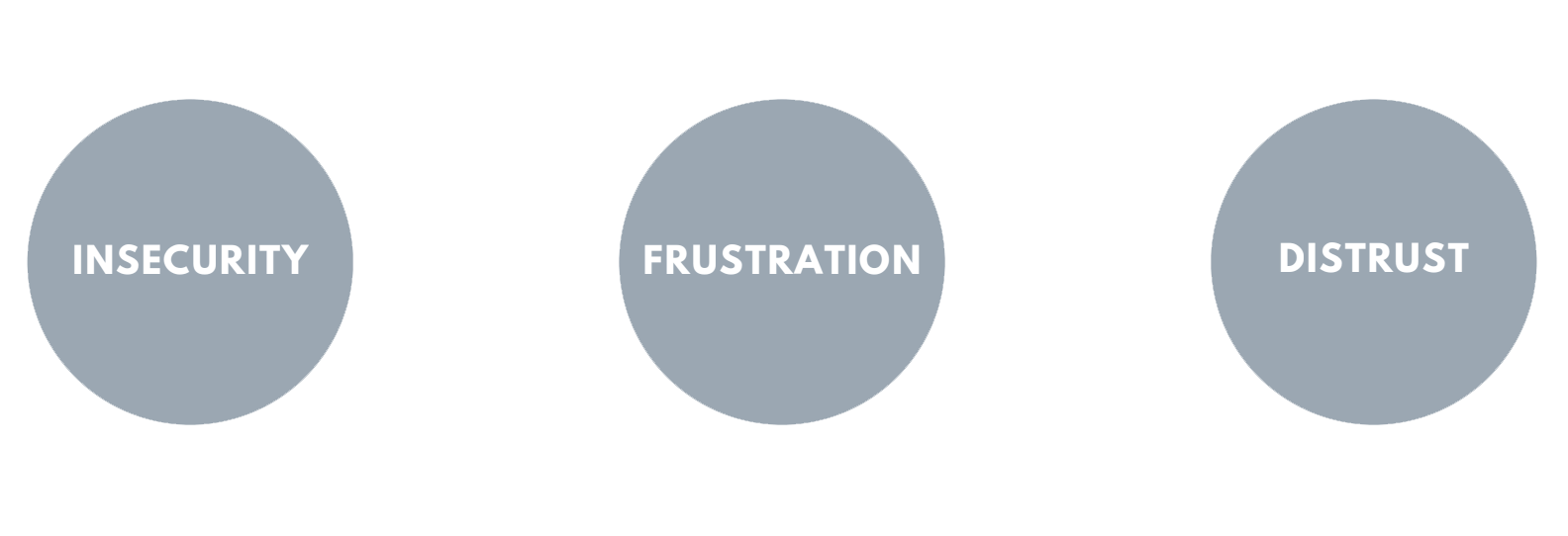
3 Key User Issues
First, insecurity. Imagine trying to communicate with a doctor who seems foreign to you. They don’t speak your language. You don’t know them. We want to increase interactivity in order to break down such barriers and ultimately develop rapport between them.
Second, frustration. Not being able to communicate effectively can result in incorrect feedback and confusion. Users need to be able to communicate in a way that is as easy and specific as possible.
And finally, distrust. Non-english speaking patients are often given interpreters, but sharing personal medical information with a stranger can be confronting and uncomfortable. In addition, many are reluctant to use health-care services at all.
User Map
We chose to focus on the consultation stage of the user journey map as it is a high stakes area that can lead to misdiagnosis and treatments that could be detrimental to the patient’s wellbeing. This was also an area that many online users reportedly found the most issues with.
Crafting Personas
From this specific user group, personas were then developed. This was an extremely effective tool to visualize our end user and how to specifically solve for and cater to their needs. Furthermore, it was valuable in terms of storyboarding in future iterations.
Understanding the complexity of the problem
We found that language ws a complex problem, with many multi-layered components which has cultural connotations, dialects, medical terminology. We must take into account of all these in order to design the most effective system. Hence we decided to explore this situation further.
5 Why's & Mind Mapping
The ‘5 Whys’ method (Muylle, S, 2004) allowed us to reach the root cause behind the problem, through continuous questioning to gradually narrow down the issue.
To initiate our brainstorming for the ideation stage, we decided to engage with the note-taking technique of mindmapping. It can be justified this was an extremely effective technique, as mind-mapping records information in a way that best utilises spatial relations to facilitate long-term relations.
Insights gained:
1) Need a differential advantage from just translators
2) Monitoring / take-home system for chronic illnesses
3) Innovation - possible through VR or interactive diagrams to measure pain levels → explaining symptoms through visuals to develop empathy
How can we empathise better with the user?
We used several methods like bodystorming, empathetic modelling, sketch-noting, affinity diagramming to empathise with the user and create more usable and user friendly product. This was followed by running a market analysis and researching upon the design precedence, visual precedence like Kwikpoint and similar apps that exist in the domain of translation.
Bodystorming
Members of our design team stepped into the shoes of the character. Innovatively due to the ‘language barrier’ of our design problem, we acted such scenarios out with our body. We generated ideas and unexpected insights through physical interaction and roleplaying.
Strong insights and flaws in our system were identified as we were able to establish empathy with our target user.
we also proposed the idea of having a toy or object in order to externalise their emotions and make it easier to communication.
Areas needing iteration:
For a conversation to unfold between the patient and medical practioner - 2 way communication
Communicating more difficult medical terms.
Empathetic Modelling
Interestingly, we thought to our own experiences and then applied how this could be experienced by those with perceptual abilities and see it from their perspective.
We came across the powerful concept of sketchnoting. Visual notes combined with annotations can powerfully help to communicate an idea in an extremely easy manner. Here graphical elements were combined with verbal elements, in order to enhance memorability and engagement, also known as the dual coding effect.
Our first concept was to have a clear whiteboard for the interaction, with 1 person standing on each side to draw out the images. However there was a strong issue that the doctor or patient may not be a good drawer. Hence we decided to make it interactive and technological with pre-loaded diagrams.
How we stand apart?
Since language translation is still a current problem, there are issues of inaccuracy and effective communication in current platforms. Whereas our concept is both novel in nature (transparent interactive board) and unique (digital two way communication) in order to tackle the problem in a distinctive and strongly successful way.
Two way communication is our unique selling point, fuelling shared understanding and collaboration. We aim for Mediboard to be able to build strong rapport between the patient and doctor, so that fear levels and frustration are reduced.
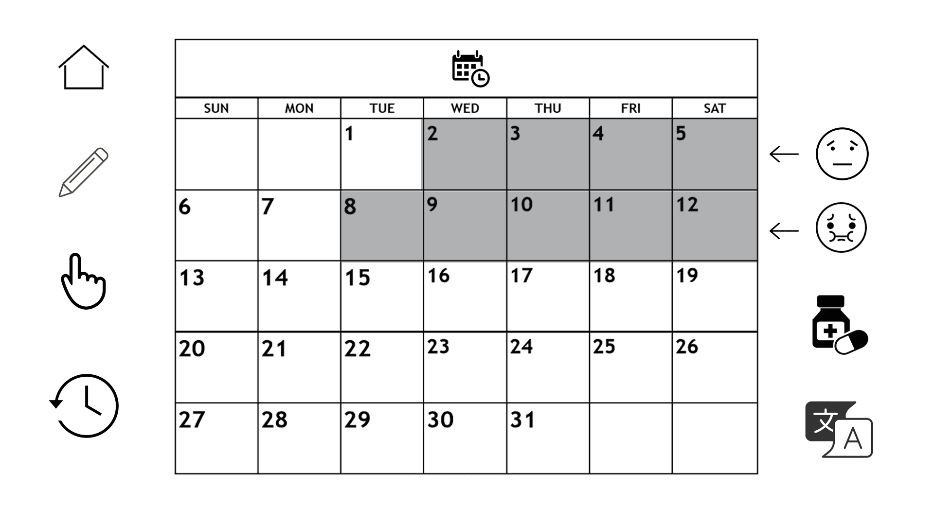
Sketching is a strong point of difference, especially give it’s innovative nature of the transparent screen. We bring the power of visual communication to a new level, communicating by drawing to retrieve real-time data and communication.
Data analytics are generated in order to provide valuable insights into chronic disorders and changes over time. This is uniquely generated when the visuals are selected, automatically converted to language on the doctors end and stored.
Experience Prototyping
To ensure our design solution is proficient enough before testing on users, we first decided to conduct experience prototyping between ourselves. Experience prototyping is an effective method to stimulate the experience and role-playing, to identify certain qualities and problematic aspects.
This was achieved by pretending there was a transparent screen between two members of our design team, and acting out touching the pad. The first thing we noticed was the ability for eye-contact, building strong report and interaction between the users. However one design flaw was identified, that when users draw on the screen, the opposite user will see it in mirror reflection.
Wireframming
Before reaching higher fidelity prototyping, wireframing is an effective low-fidelity prototype in order to illustrate the fundamental structures of a system. They offer a formal way for designers to communicate the design, without excess images or colours which may distract from the core purpose.