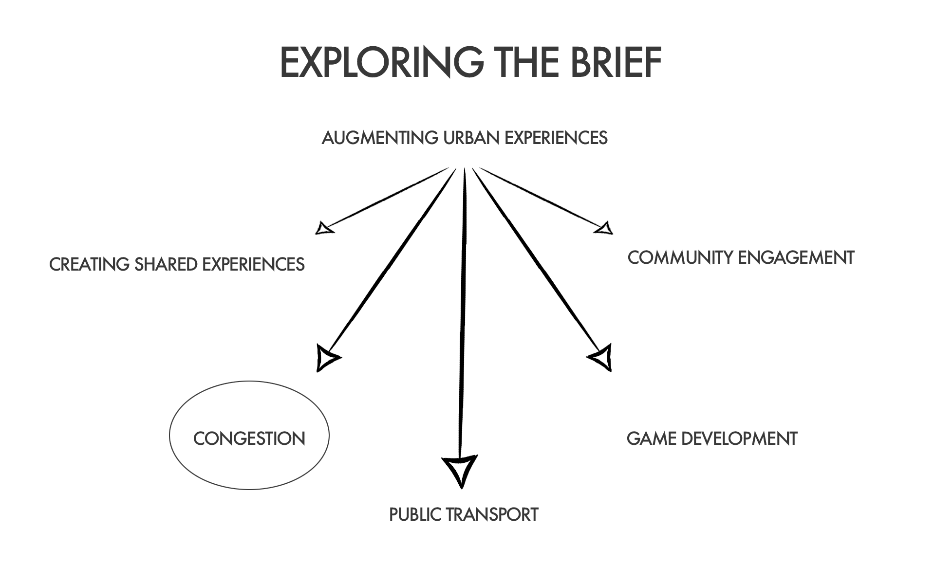
Design Brief: Augmenting Urban Experiences
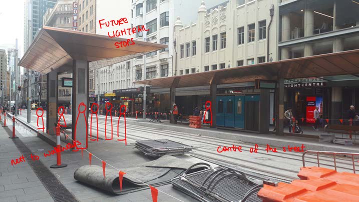
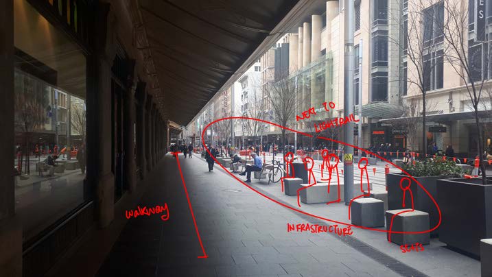
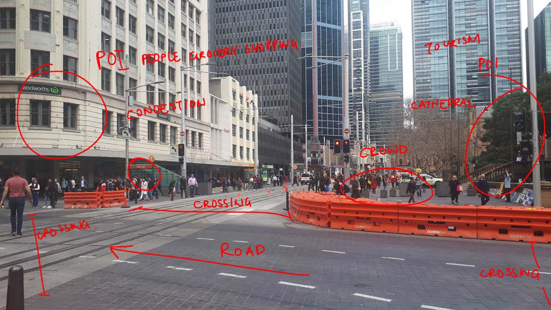
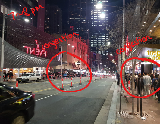
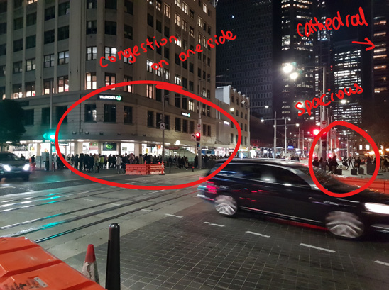
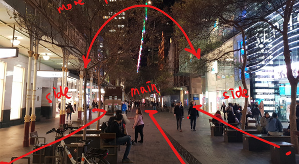
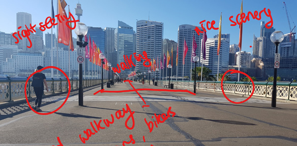
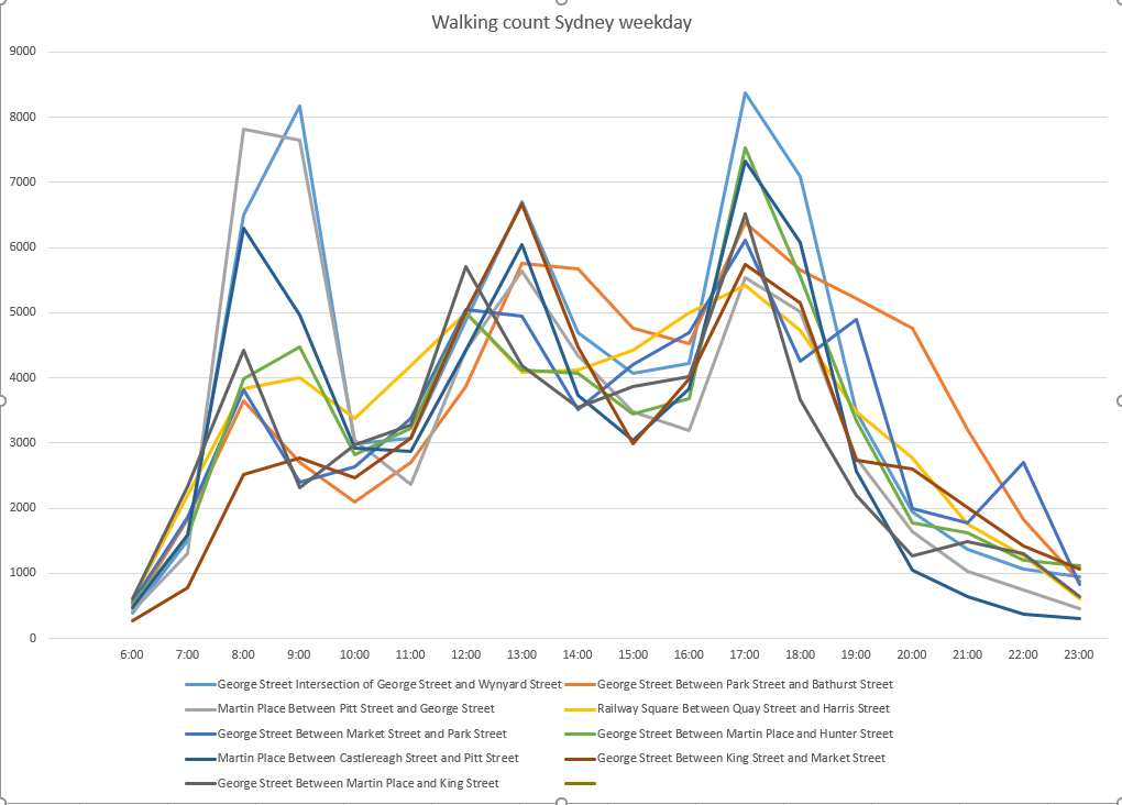
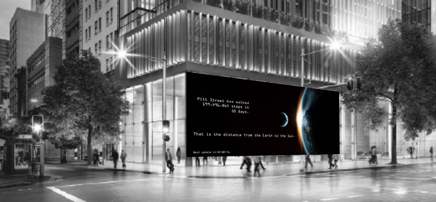
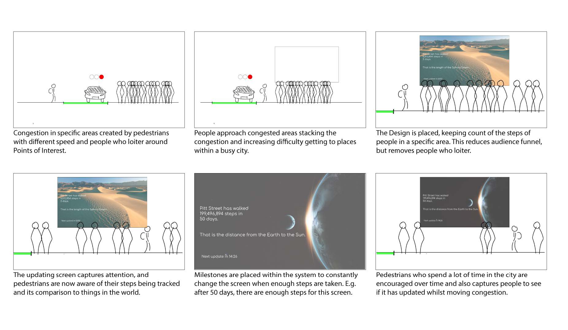
As cities become increasingly urbanised and populated, pedestrian congestion
continues to rise.
Unsustainable numbers of people in these urban environments can lead to a lack
of walkability in cities, as streets dense with foot traffic lead to a more constant
need for repairs as well as safety concerns.
A lack of walk-ability in cities has been
proven to increase stress and anxiety for people, leading to a less approachable
environment for pedestrians and a lack of empathy towards other people on the
street.
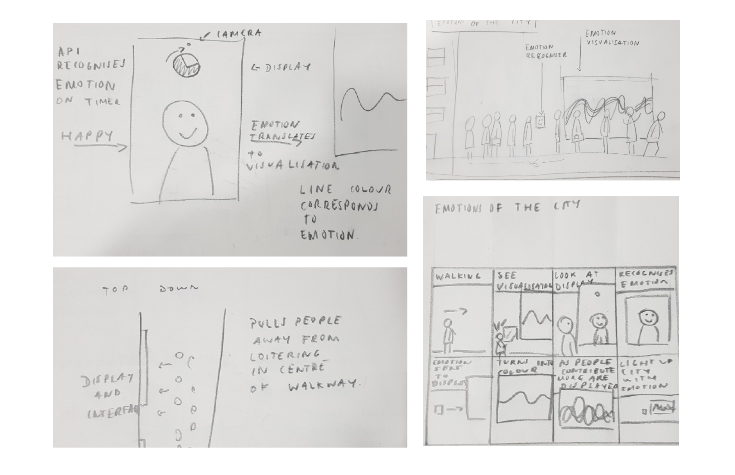
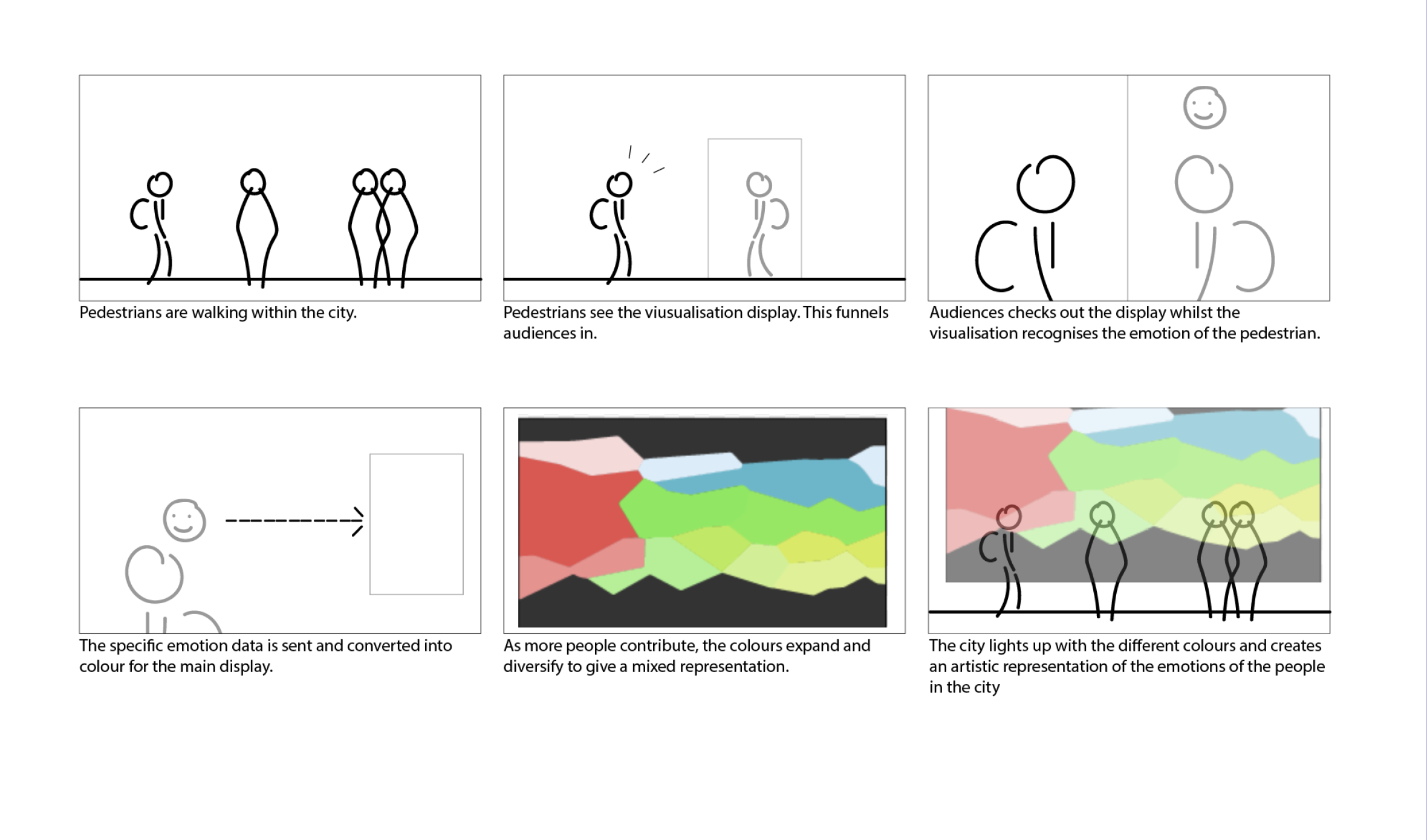
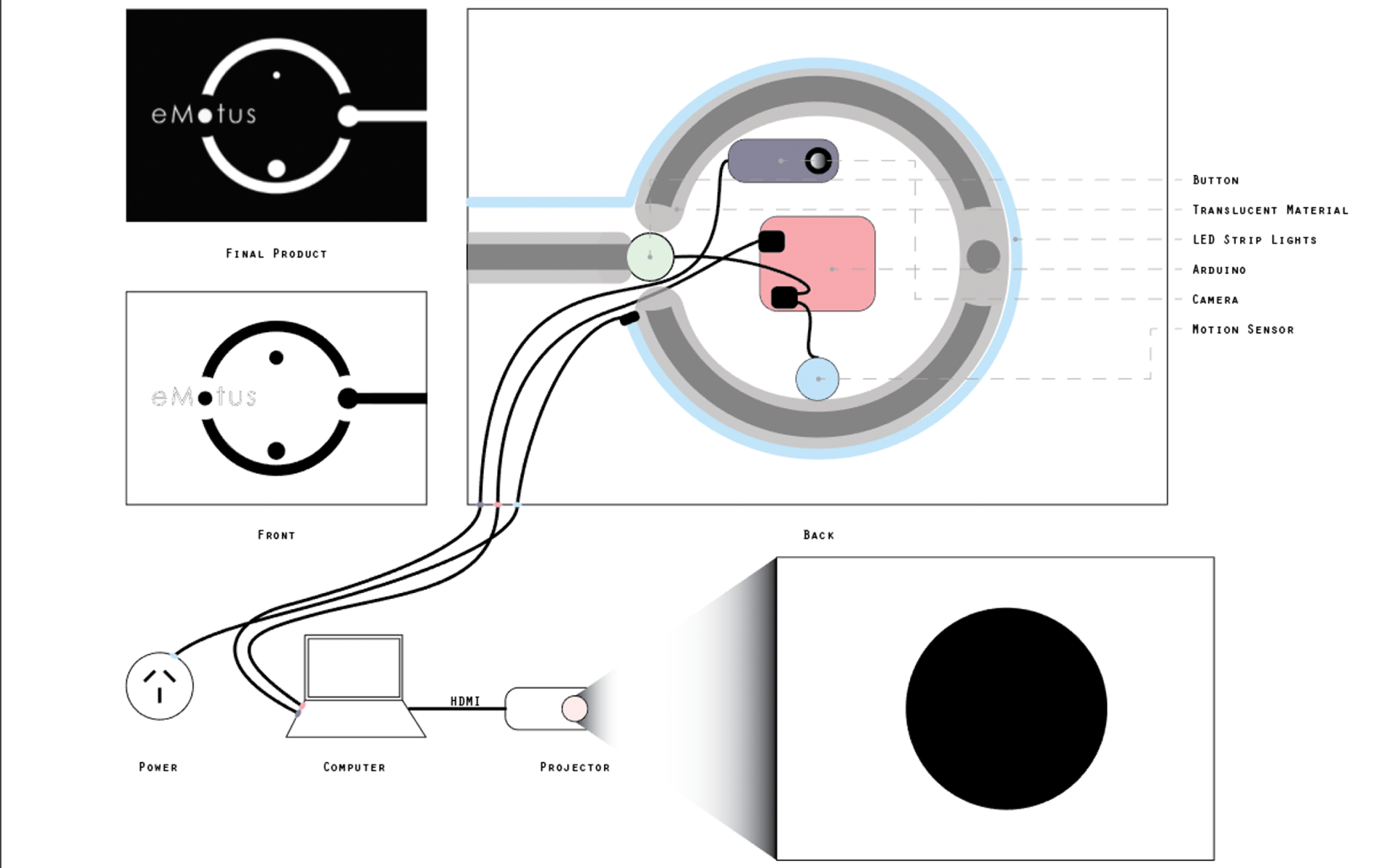
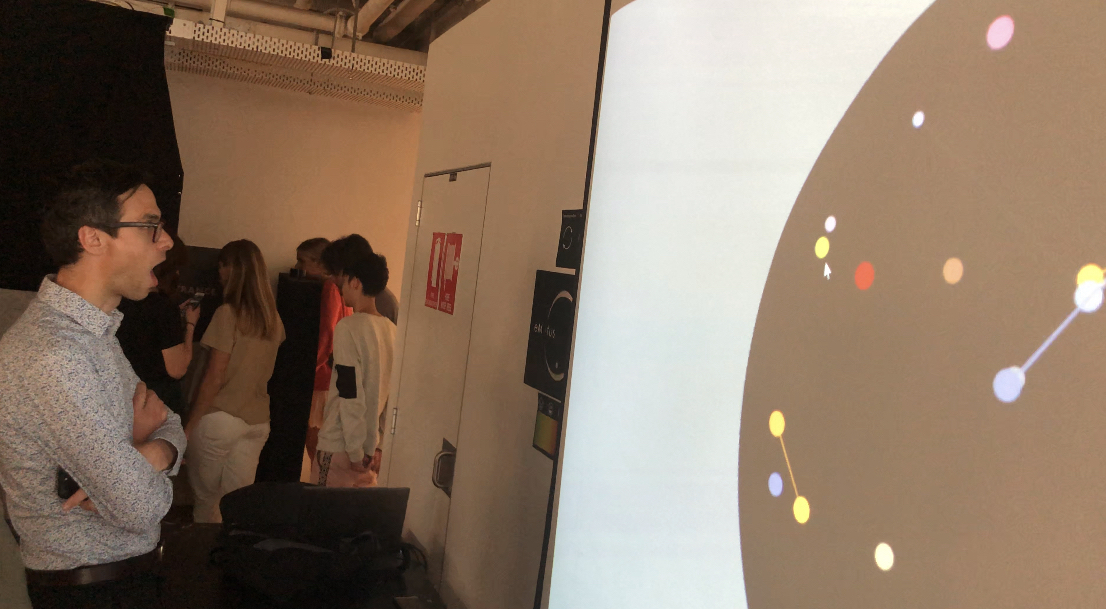
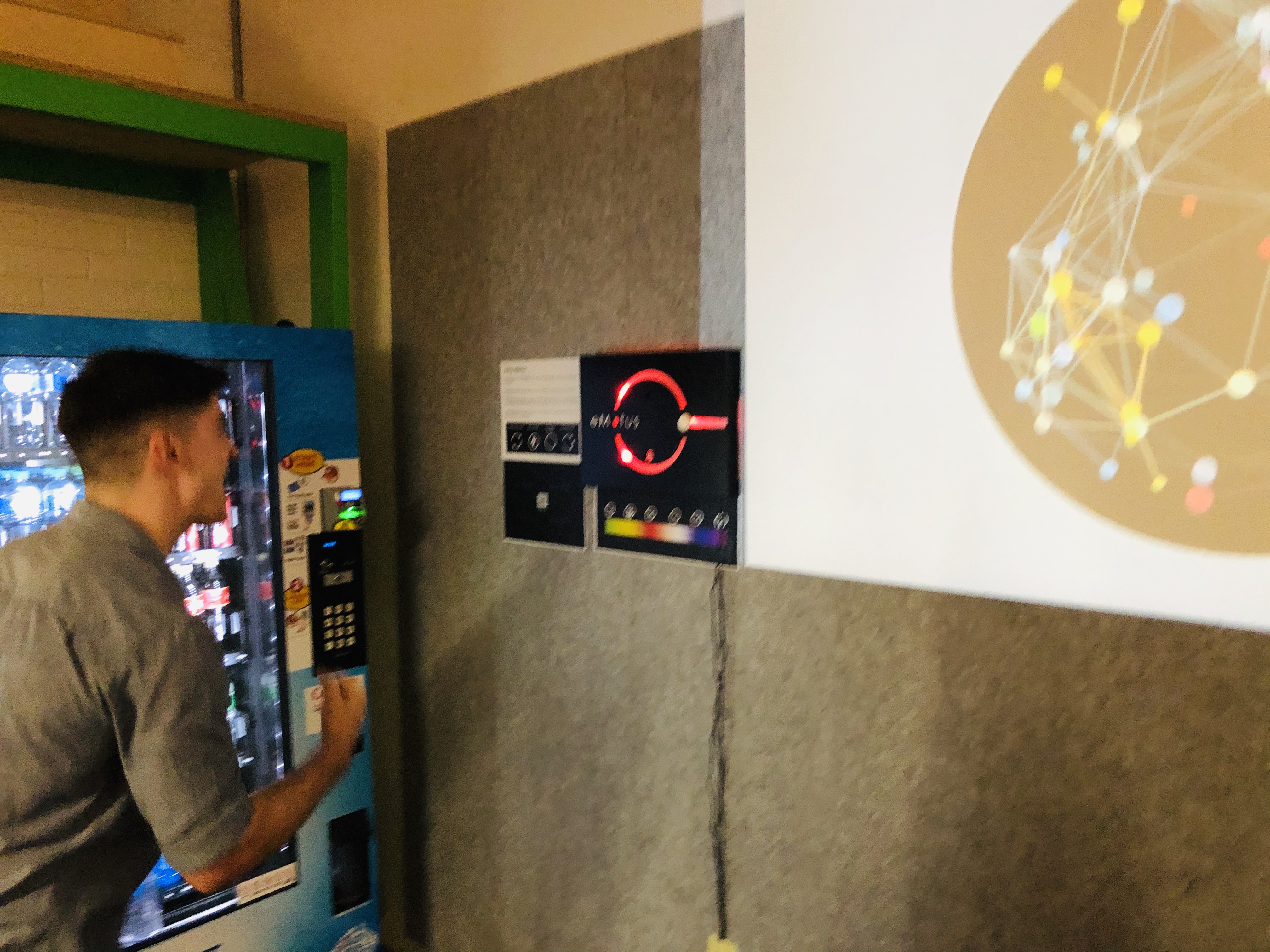
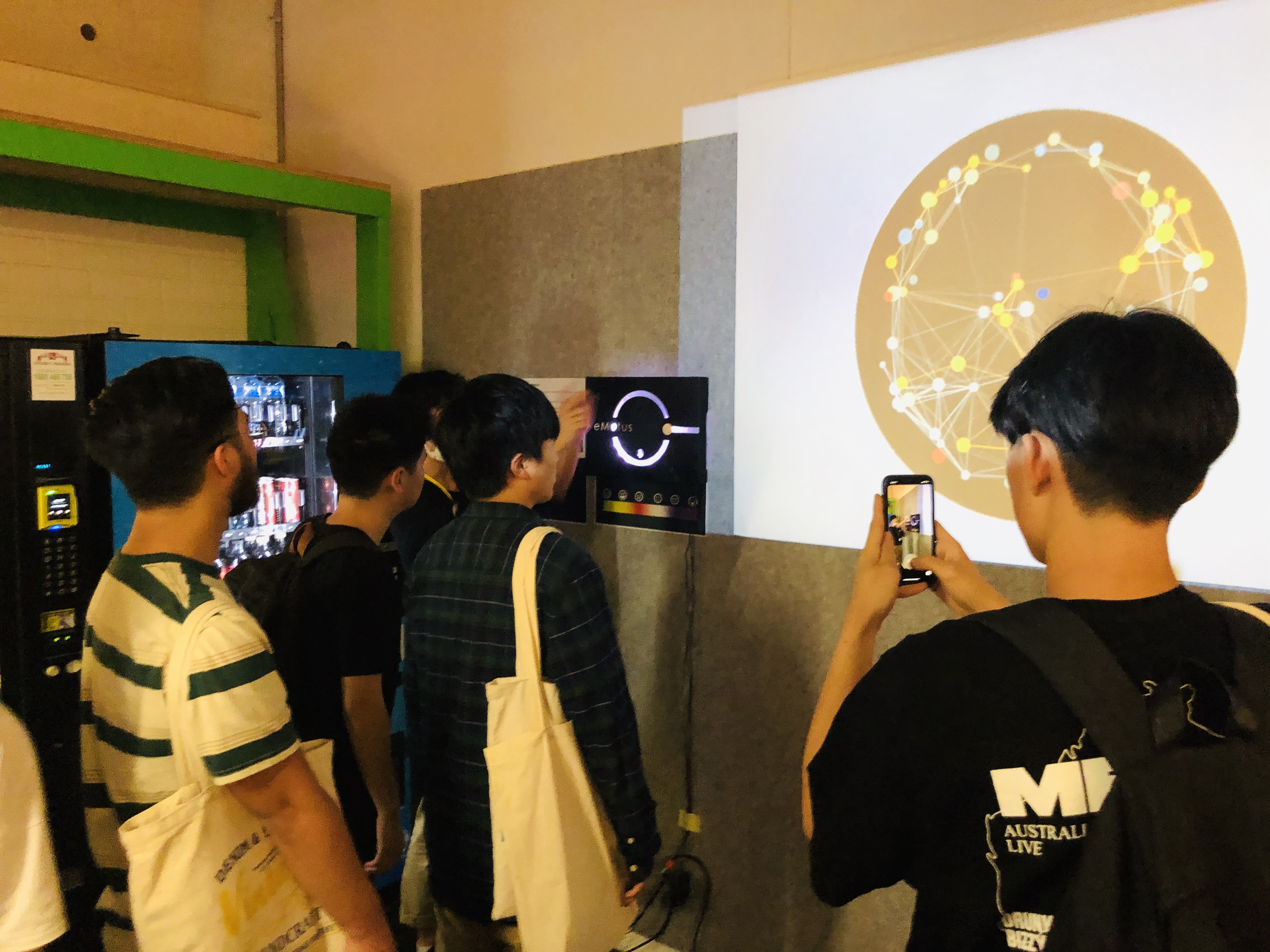
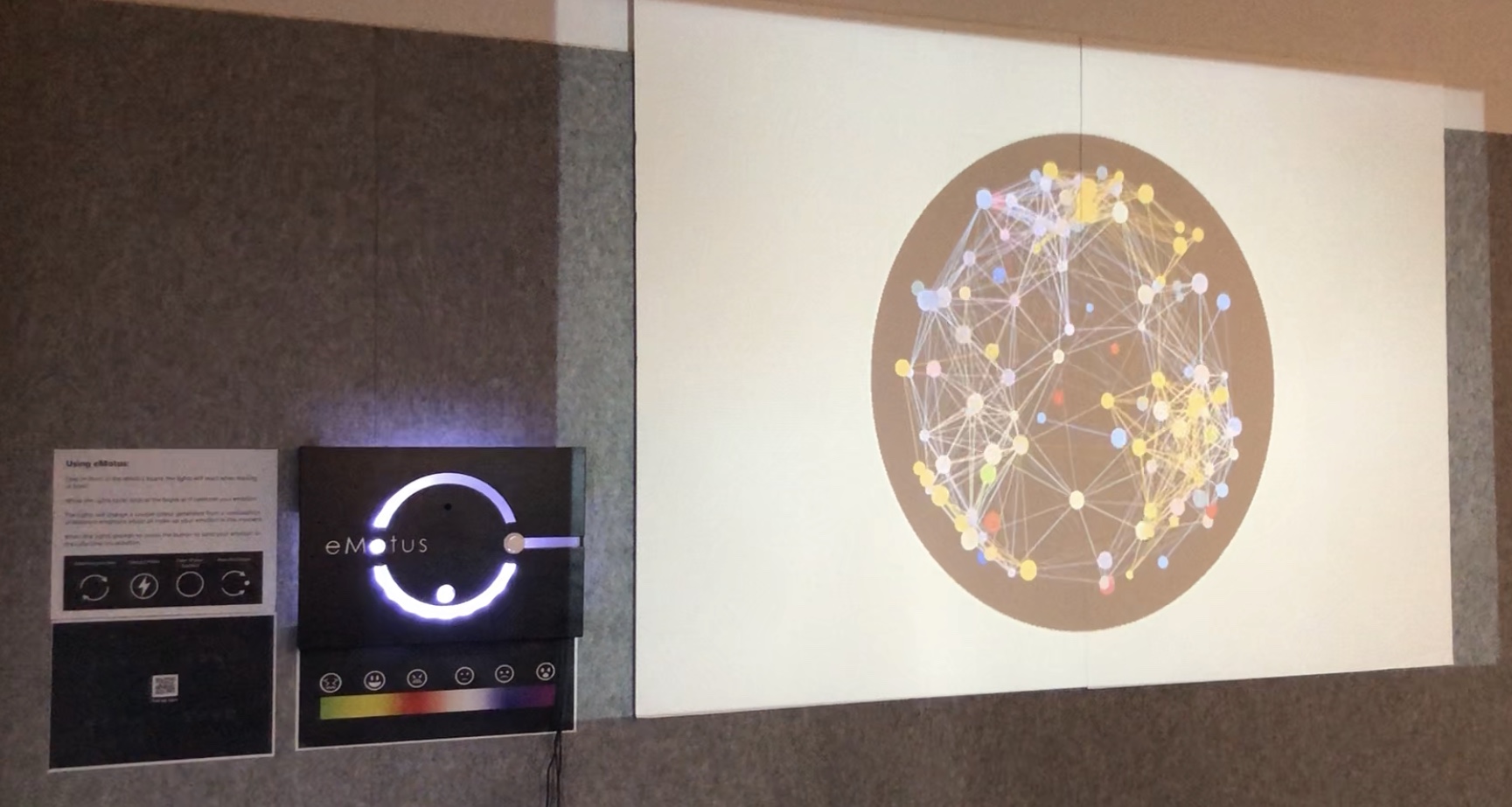
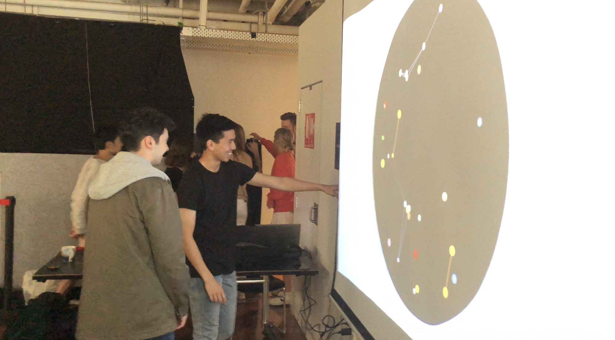
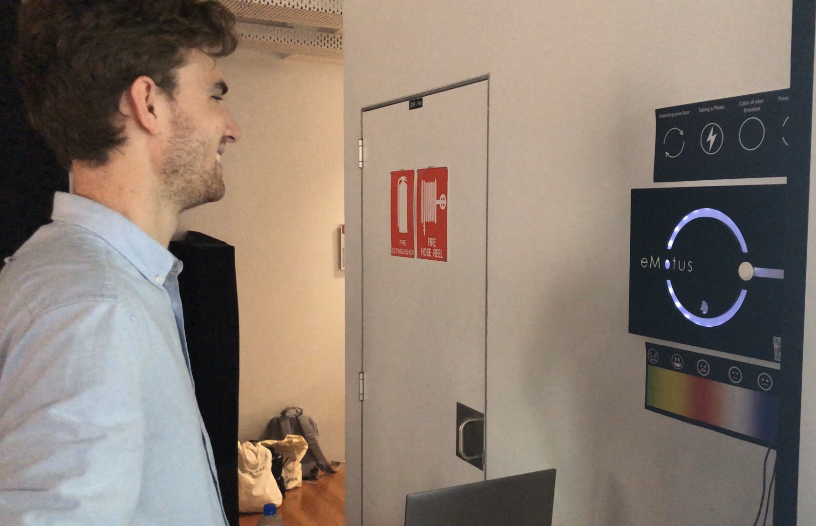
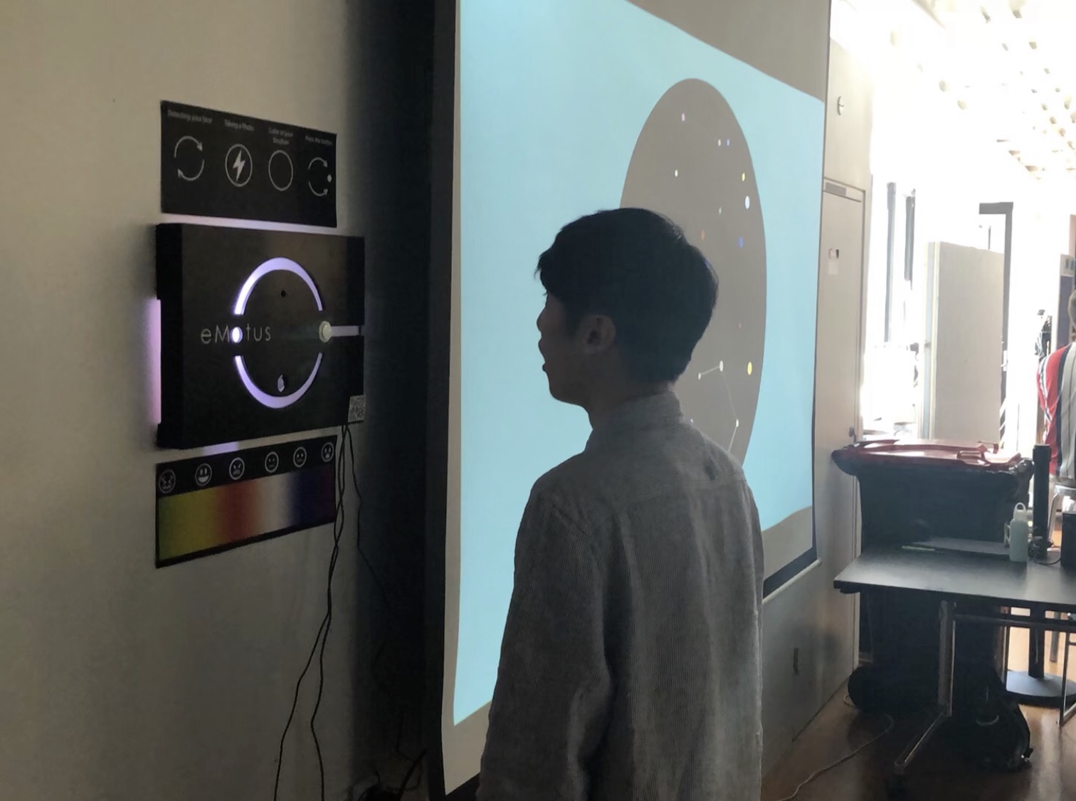
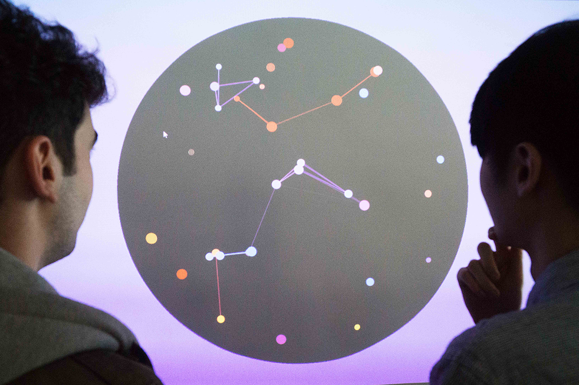
eMotus is an interactive emotion tracking and visualisation system is a method of augmenting urban experiences, to give people a new way to perceive the often unseen information of emotion within these urban landscapes.
It is an interactive display that detects the emotions of a passerby that engages with it. Using facial recognition API, the emotion of the person interacting is determined and converted into a colour that best represents the data captured. The user is then prompted to use gesture control to contribute their emotion into a large art display of a mosaic of emotions, presenting the way people feel when walking to the public.
Timeline: 13 Weeks - 2019
Role: Researcher, UX/UI Designer, Product Designer, Web Developer and Videographer
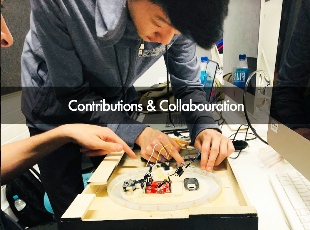
Team: Abhinav Bose, Daniel Lee, Dominic Musolino, Ray Hwang
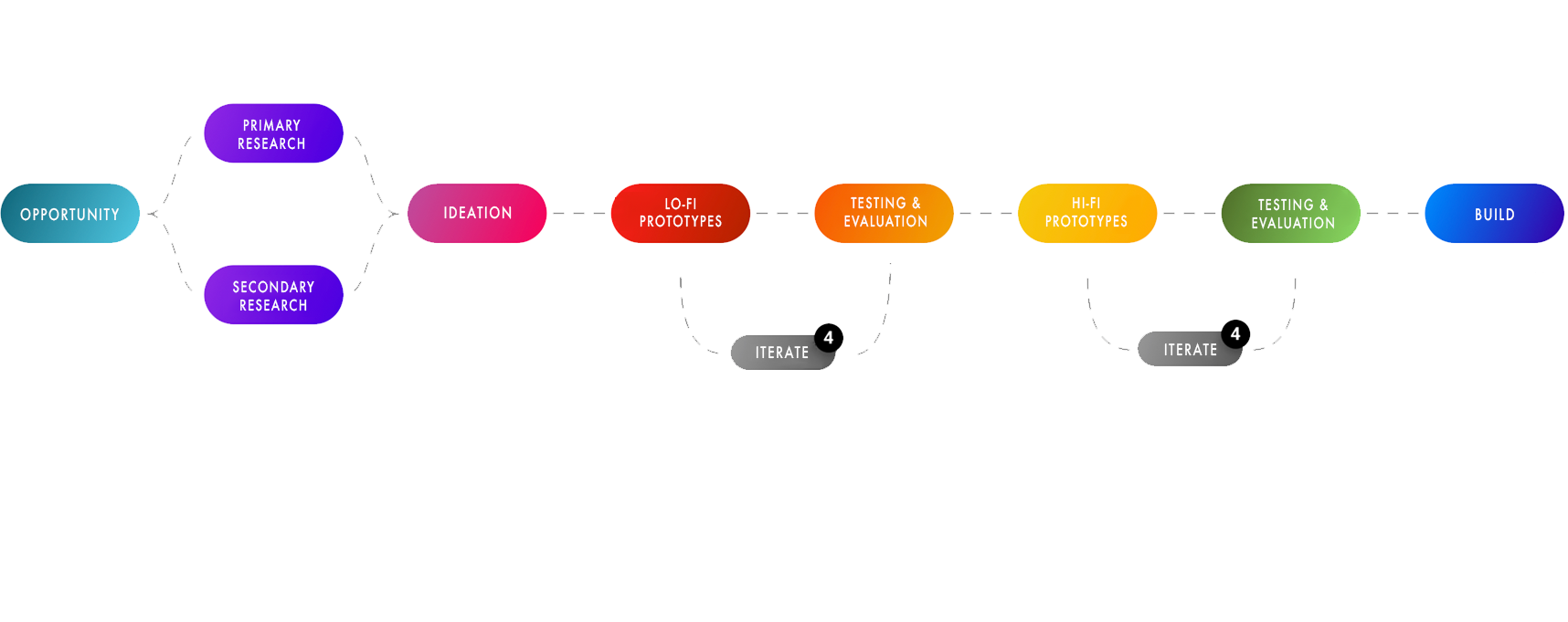
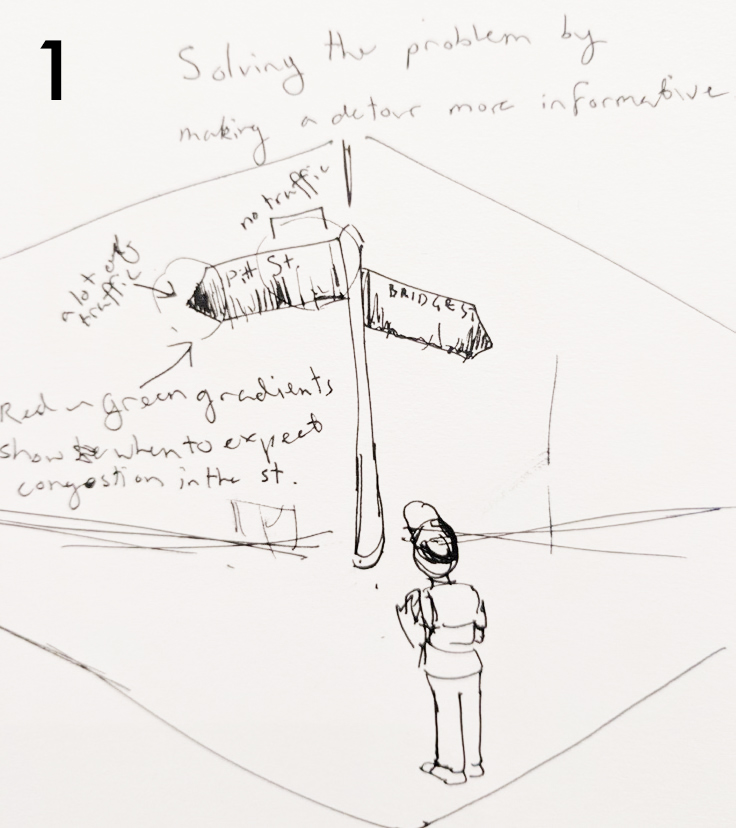
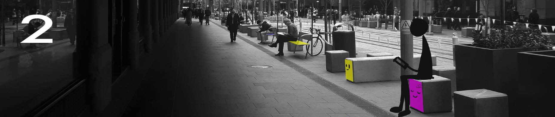
STAGE 1
a. Exploring the brief
b. Concreting problem
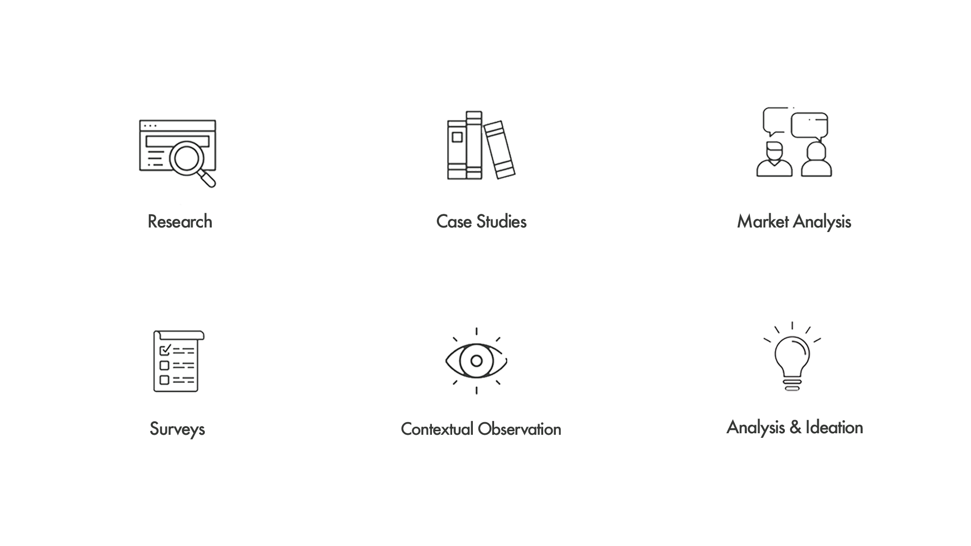
c. Research
d. Identifying user needs
e. Ideation
STAGE 2
a. Lo-fi prototype construction
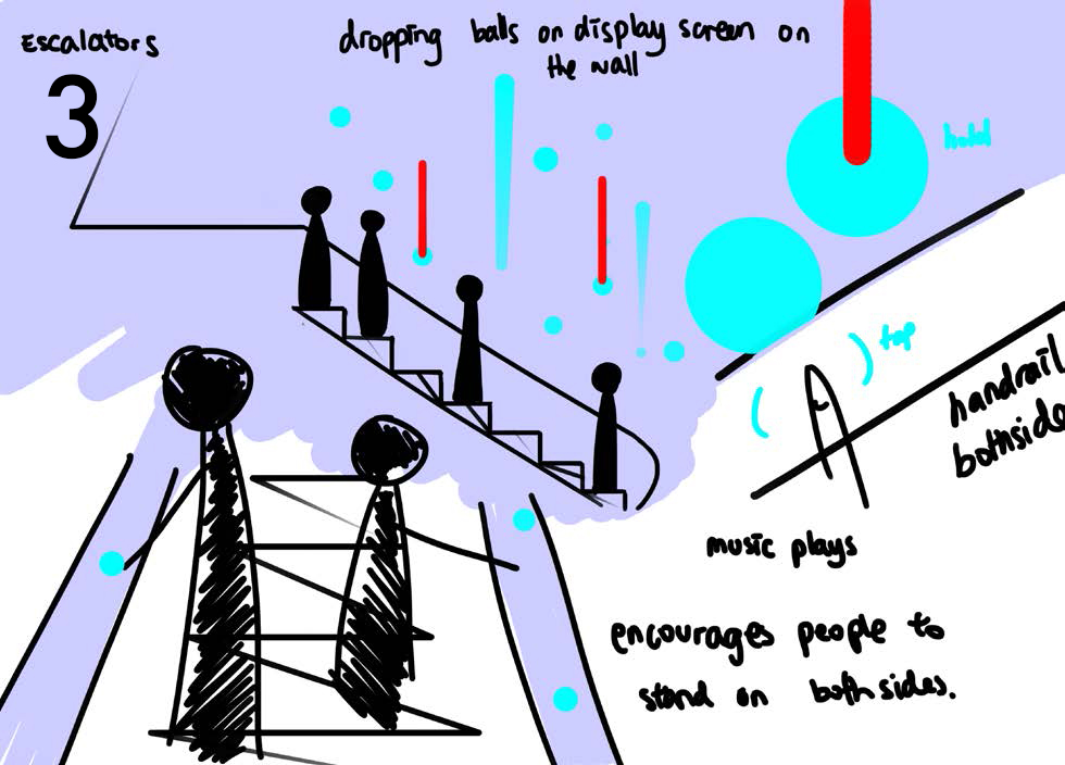
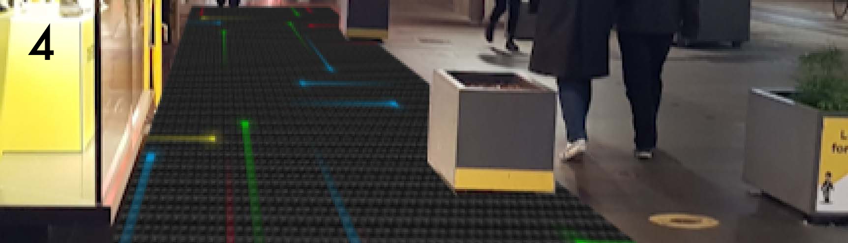
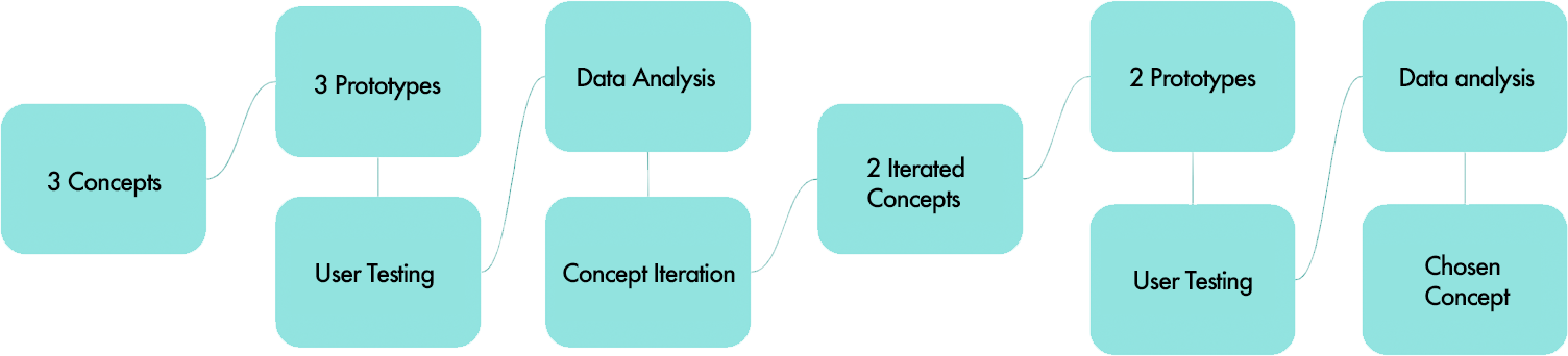
b. User testing 3 concepts
c. Data analysis
d. Iteration of chosen concept
e. User testing
f. Decision matrix
STAGE 3
a. Physical product creation
b. Curating the UX
c. Website development
d. Software development
e. Visual art development
f. Product documentation
g. Exhibition
STAGE 4
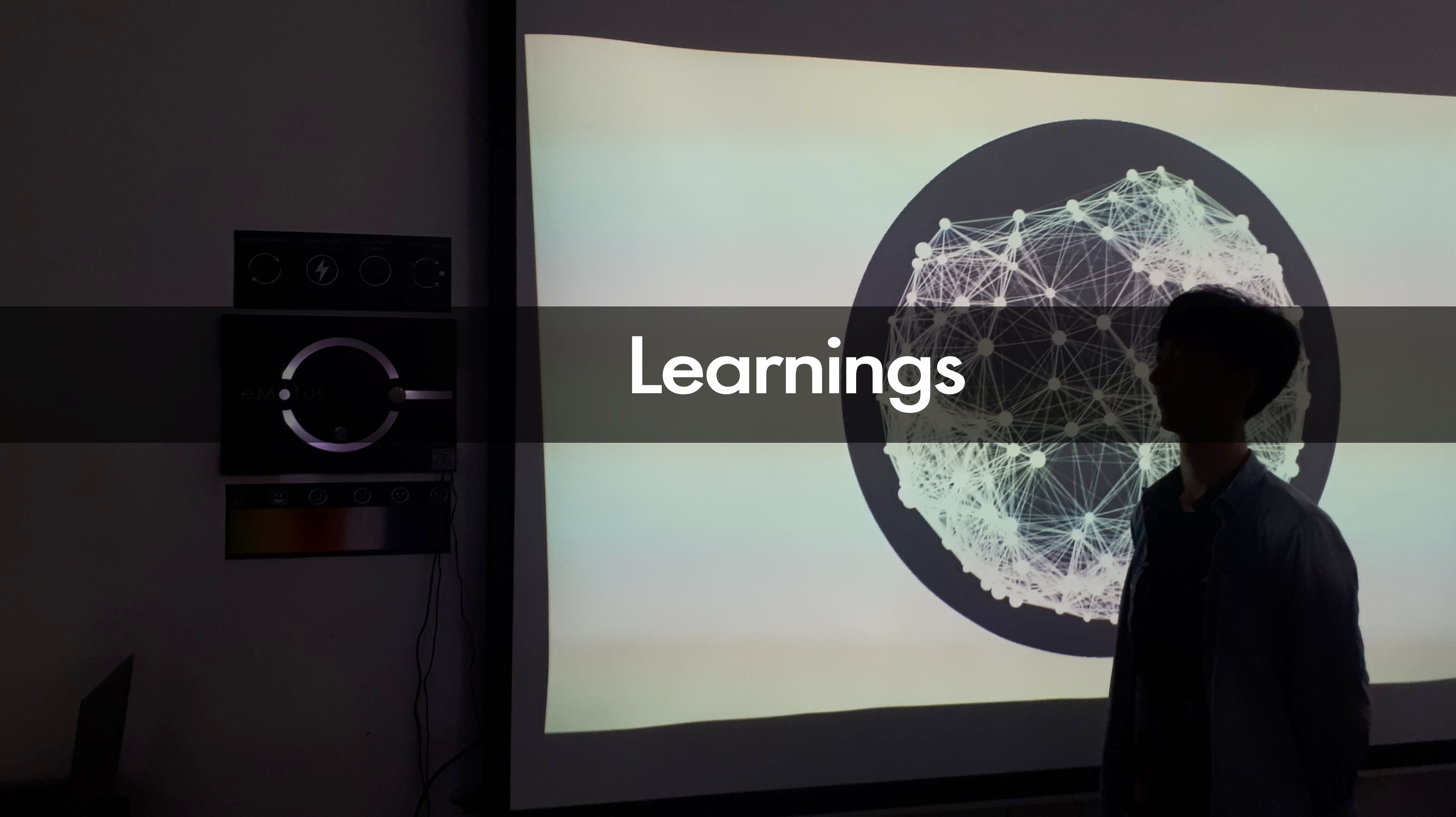
a. Summary of project
b. Challenges during process
c. Experience and learnings
We were amazed by the amount of creative ideas that were running in our head related to this brief. We could tap into any domain and build something with an impact. We explored a couple of options based on things we wanted to improve around us. Finally after some research into different domains we could find the one that the entire team agrees upon. We all saw Pedestrian Congestion as a pressing issue in our city and hence we did further research on it.
"WALKABILITY"
Making a city more accommodating for pedestrians not only increases the way people feel about their environment, but has been proven to increase the value of a place.
ATTRACTIVE CITIES
People are more likely to walk and engage with their
surroundings in interesting and novel environments.
EMPATHY
Walkable cities allow people to be more empathetic to other
pedestrians.
CHANGING THE BUILT ENVIRONMENT
Creating positive, enticing and channelised walkable
experiences by refurbishing the environment.
USE OF TECHNOLOGY
Creative use of technology to introduce new
methods of displaying information or feedback.
PLACEMAKING
Utilising space within cities to create places people
want to be in.
We observed the state of Sydney pedestrian traffic. We found that the space is being used by people of different needs, with these priorities shifting as time changes. Additionally, people walk primarily out of necessity, and prefer shorter routes when other routes seem less effective.
After surveying 24 participants on how they feel and what they’d do to change the way people move throughout cities, we found some key insights to define the areas we should focus on for concept generation. These insights were expanded upon through some affinity diagramming to get to the crux of the issue.
We came up with about 7 unique concepts to solve these issues out of which 3 concepts were further prototyped and tested.
Concept 1: EMOTIONS OF THE CITY
An interactive display that detects
the emotions of passersby that
engage with the display, and reacts
appropriately, creating a mosaic of
visual representations of emotion.
Increasing Walk Appeal
A wall mounted display would be
used to present the array of general
emotion from people that pass by to
engage people and increase the
visual variety and walk appeal of an
area.
Concept 2: Musical Nexus
A vision-based, interactive
musical experience which allows
anyone, even untrained
musicians, to dynamically
influence music, like what a real
conductor or DJ would do.
Utilising Placemaking
Place-making refers to the use of
underutilised or underappreciated
space in creating new and unique
experiences, distributing
pedestrian density more
accordingly.
Our research highlights that shared musicmaking is a sophisticated
example of the potential of music to express emotion and
stimulate empathetic understanding between the community.
Concept 3: Global Footprint
A live, interactive information
visualisation that calculates the
number of footsteps in a specific
area, and compares it with
travelling distance between
different pats of the
world/universe.
Long-Term
Increasing Walk Appeal
By creating an interactive
information visualisation that
changes over a long period of
time, we thought this concept
would give a sense of familiarity
to pedestrians as well as an
opportunity to streamline flow by
pulling away idle people.
1. Street Heat Sign:
The Street Heat Sign utilises problem
solving through detour encouragement
by creating a gradient map of the current
pedestrian congestion in the specific
directions people want to head.
By just
looking at the sign pedestrians will have
information on exactly what part of
that street is congested and can route
accordingly.
3. Escalator Handrail Tap:
Escalators are currently
being used inefficiently due
to cultural norms of splitting
people who want to stand still
and walk. This inefficiency
becomes a major problem in
terms of safety due to uneven
distribution causing escalators
to malfunction and collapse
harming masses amount of
people.
This design looks to prevent
people from walking up
the stairs and standing still
on both sides through an
interactive music making with
all it’s participants.
2. Seat Seeker:
Interactive seats are a way to encourage people who stand still to take a
seat next to the walkways to prevent them from
obstructing pedestrian walkways.
The faces displayed through a digital screen will look inquisitively as
people walk pass, but stare at and target people who stand still in one spot
for too long. Once detecting a person sitting on it, the seat or the whole
square block will lightly glow and the face will go to sleep as a sign of it’s
done it’s job.
4. Pixel Grid Floor:
The Pixel Grid Floor concept depicts business/congestion within an area
with a floor covering certain areas of a walkway/footpath. Congested
points will produce a lot of coloured lights which spread out in a gridbased
space.
The Pixel
Grid Floor enables movement and interaction within that area, and by
encouraging movement for more interaction, loitering and any idle waiting
can be pulled towards the outside of the congestion.
1. OBSERVATIONAL TESTING
Observational Testing is a live testing method in which specific indicators for the
function of the prototype is assessed on the fly.Contextual Observation was also conducted to develop a better understanding of how users interact with our prototype. by analysing the facial expressions, gestures and actions of users.
2. INTERVIEWS
Interviews is a crucial part to a human-centred design as it allows potential
stakeholders to be an active part of the design process. Semi-structured interviews allows us to go further than first impressions and
helps users empathise with the reasons behind each prototype.
3. SYSTEMS USABILITY SCALE
The System Usability Scale consists of multiple questions and a couple of
open-response questions, mostly judged through a ‘Strongly Agree’ to
‘Strongly Disagree’ Scale. It’s a useful tool for measuring the usability of
prototypes and differentiate between usable and unusable systems
about the prototype.
4. Think Aloud Method
We conducted the Think Aloud method as it allowed us to grasp a deeper understanding of the thoughts and feelings of users as they are interacting with our prototypes. The participants are made to talk while interacting with the prototype.
5. AFFINITY DIAGRAM
Affinity Diagramming is a data analysis method that addresses
users/audiences’ needs and wants with a single sentence. The large
amount of data gathered is broken down into opinionated, suggestive
or emotional phrases, then grouped up into similar perspectives that
target the general need and want of the user/audience.
Affinity
6. HARRIS PROFILE / DECISION MATRIX
The Harris Profile or Decision Matrix is a simple but effective
analysis method that allows prototypes to be judged overall with
an emphasis on how effective each aspect of the prototype was.
Each aspects of the prototype is weighed, then given a scalar
score in order to find the total effectiveness of the prototype
To prototype this concept, we created a large poster to represent
a display and presented it in a high foot traffic area.
As people
walked by we counted each one and incremented to the stats on
the visualisation, using thread to mark paths the people have
collaboratively walked.
This was to see if people would engage
with the information being displayed, and if it would catch
people’s attention.
Key Findings
To prototype this concept, we used paper to represent the
displays with printed paper strips to represent the emotions
being contributed. A mirror was also used to represent a
camera. This presented on an easel
within a busy walking area as to test if this idea has the
potential to attract people passing by.
As people look into the mirror of the prototype, they would be
asked what emotion correlates the most to how they currently
feel, to simulate how a potential facial recognition API would
detect their emotions. Their emotions colour was then pinned up
on the corresponding visualisation, resulting in a mosaic of
colours.
Key Findings
To prototype this concept, we used Wizard of Oz testing to
simulate a user having control over a musical piece. To display
these controls to the user, we displayed the default kinect
skeleton motion tracking over some static buttons, to see if users
would instinctively know how to control a motion controlling
system.
This was testing in relatively high traffic area also, to see
if people would engage with an interactive system like this if it
was presented in a public area.
Key Findings
We decided to iterate on this concept using the feedback we
got from our user testing for the previous version about lack
of interactivity, continuity of interaction, incoherent feedback
and visualisations, privacy issues.
We used a digital display to help visualise the art and give us
a higher level of interactivity, as well as a kinect to add some
more advance controls. We also used a silhouette instead of
camera footage display to address privacy issues.A QR code
was also added to help people learn more statistics and
information about the project.
UI and Interactivity needs to be clear and precise, as well as
making the objective of each clear from the initial
introduction to the concept.
People want to have simple but engaging interactions in
cities, that don’t necessarily obstruct them but enhance their
average experience.
A balance needs to be struck between interactivity, usability,
and the potential to solve the problems - the Musical Nexus
may be more engaging on an interaction level, but ends up
being less usable or feasible than the Emotion Tracking Idea.
People may gravitate towards novel installments or objects in
an urban environment, but for regular pedestrians this
novelty wears thin and reduces the impact of repeat
experiences.
We gathered the various hardware and
materials that would be needed to create
this product, starting with the hardware, we
decided to use an arduino paired with a
motion sensor, button, camera and rgb led
strip to power our physical interface.
This
was to be placed within a physical housing
made of plywood and lasercut to allow for
light to pass through. We also planned to
spray paint the housing black, and coat it
with a clear finish. A computer for
the software and calculations to be run on.
It works through multiple pieces; Starting
with a physical interface, people are
prompted to stand in front as it captures an
image of their face and sends it to an API
which returns a general confidence rating
of the different emotions the person may be
experiencing.
After this, a colour is
calculated based on combining different
colours we assigned to each emotion and
calculating a weighted average, which
ultimately assigns each person with their
own colour of emotion, meaning two
different people will be unlikely to be
assigned the same colour.
After the colour is created, the
user is prompted to press a
button which sends their emotion
to the larger visualisation display
which is projected/presented on a
wall next to the physical interface.
The visualisation presents a large
animation on new animation
entry, to show users their place
within the larger picture of
emotion of the environment.
The overall flow,
experience and interaction was backed up with limited feedback. We created a Web based platform for the users to learn more about the project and provide additional feedback to the onces seeking it. The website is dynamic and provides live stats of emotions of the city, details on how the user data is used and not stored. It provides FAQS, reviews basaed on general enquiries, feedback of people and tells the complete story about the issues this concept is addressing. Its created on HTML5, CSS3, Bootstap, Javascript platforms.
To Sell our product idea to prospective clients and explain our concept to the public, we produced a product video. It explains the problem frame, the birth of emotus, the features and interactivity is offers.
We used Microsoft Azure’s Face
API as a method of gathering emotion data of the user.
In order to interact with the API, we used Visual Studio
winforms app, paired with the .NET
framework would allow our camera
to take images and subsequently
analyse them for emotion data. This
communicated with arduino over a serial port, to
initialise the interaction and facilitate
light animations.
To create our visualisation, we used
Processing, a visual programming language based on
Java.
This would also
allow us to communicate with the
emotion data generated by the
winforms visual studio app and
continually update with new data.
The Project was setup at the D19 Exhibition 2019 at University of Sydney and Design Careers fair 2019 Sydney as well. We received an overwhelming response from people. Over 1000+ users interacted with the exhibit on the day of the exhibition.